The Atlassian Illustration Library and Guidelines
We have provided a number of ways for people within Atlassian to access a library of illustrations. We wanted the library to be accessible for those in the company and have the ability and pick and choose based on their requirement. We’ve built an extensive library with over hundreds of illustrations to choose from and organized with scale (spot, spot hero, hero etc), types (device, object, people etc) and more. There are preferred formats the library takes depending on the use case for the illustration.
atlassian.design
For raw SVG and PNG files, the library found on atlassian.design is preferred. Some examples of where these types of files would be useful are:
Adding an illustration to Confluence
Using an illustration in product
Creating a quick internal poster
Creating a social media asset
Using illustrations in the presentation kit


Scaling spot hero and spot illustrations
This is one of our “sweat the details” moment, where we thread the visuals or motifs throughout our illustrations. This can be scaleable from a product icon up to a spot illustration. Not all visuals fit in this category. However as a nice to have, this was something that we wanted to carry throughout some of the metaphors.

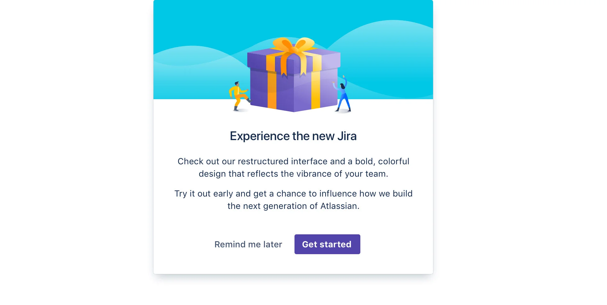
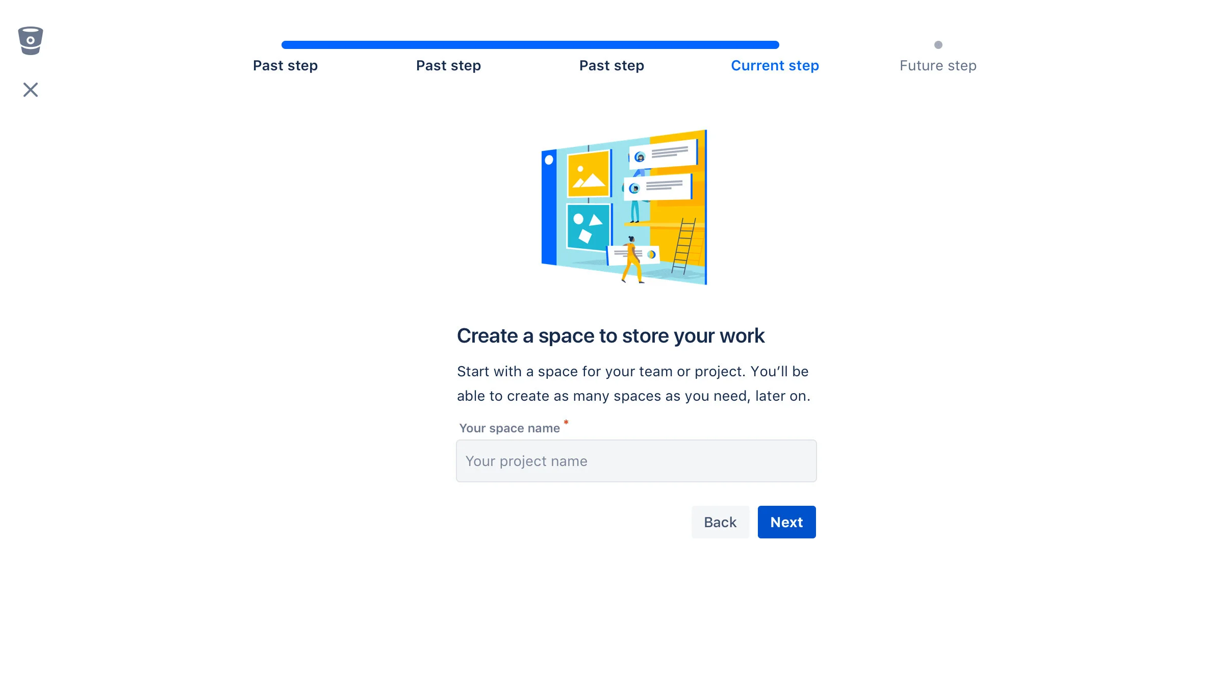
Spec details for in-product illustrations
Working on the design system team I looked into the spec details for illustrations. Some patterns and components include: onboarding (spotlight, user benefits modal), empty states, focused task, inline dialog, avatars and emails. These would include recommended sizing and type of illustration that should be used.
Below are empty states for Stride. It was important that illustration isn’t a decorative piece, rather something this is paired with other details like copy and the context it sits in.