Illustration Refresh — Yahoo
Year
2024 (end) - 2025
Credits
Illustrators: Maryanne N and Nick S
Partners: Meg R (Manager)
Problem and Opportunity
Another company, another brand refresh — and Yahoo is no exception. As the company reimagines its brand vision, the demand for product illustration across our ecosystem has grown rapidly. The Illustration Team saw an opportunity to get ahead — rethinking how we support product teams while staying in sync with the evolving brand direction.
This effort involved close collaboration with Brand, Marketing, and GMs across key products like Mail, Finance, Fantasy, News, and Search. With such a wide range of product personalities, it became clear that our illustration style needed to be flexible — able to stretch in tone and application while staying grounded in a cohesive system.
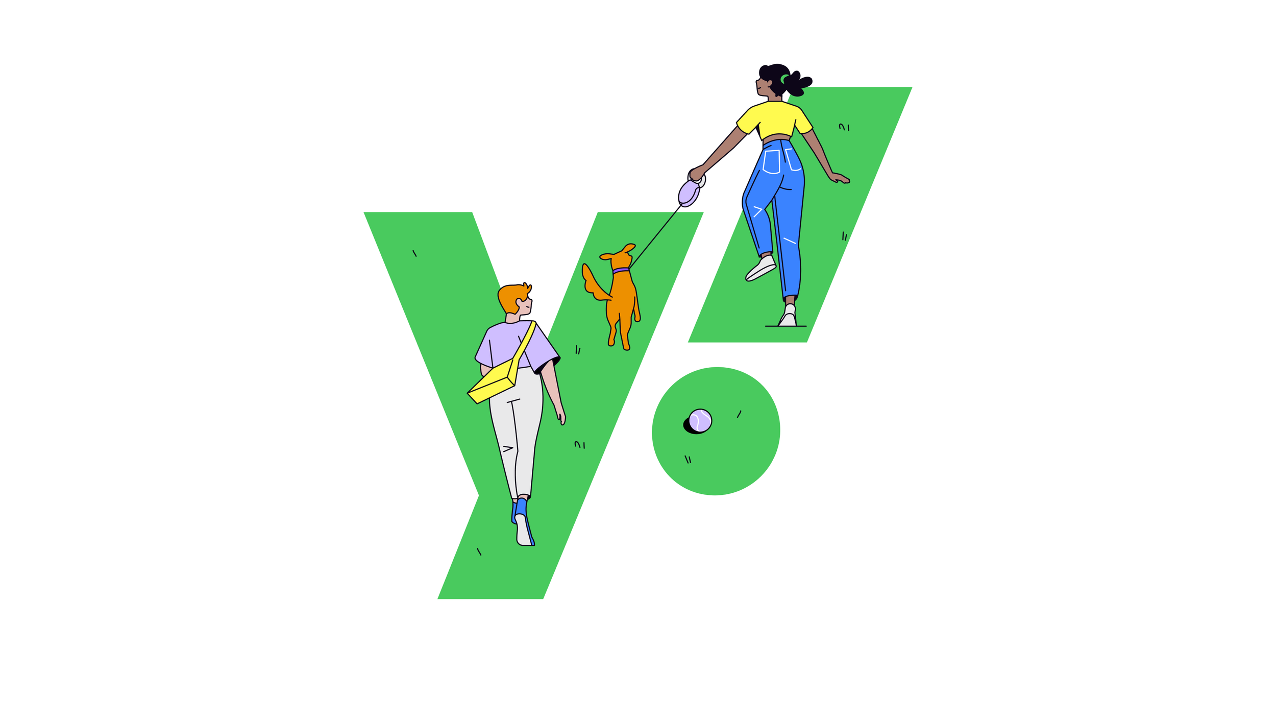
We defined our product illustration voice as warm, approachable, dynamic, and grounded. Below are some of my explorations that bring this new visual story to life.
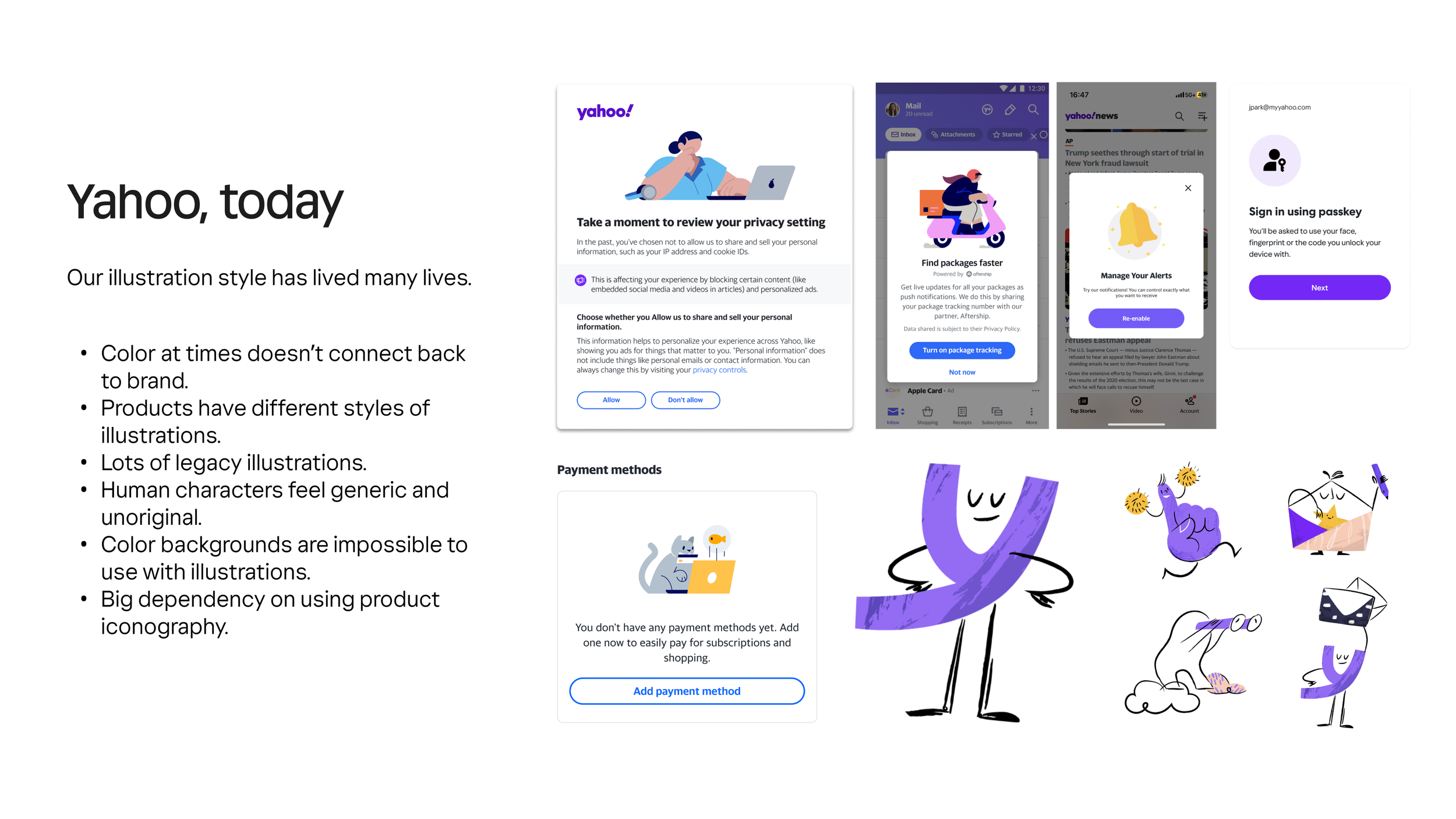
Yahoo’s illustration style has lived many lives across it’s rich +20 year lifespan. From fun characters to typical product illustration aesthetics.
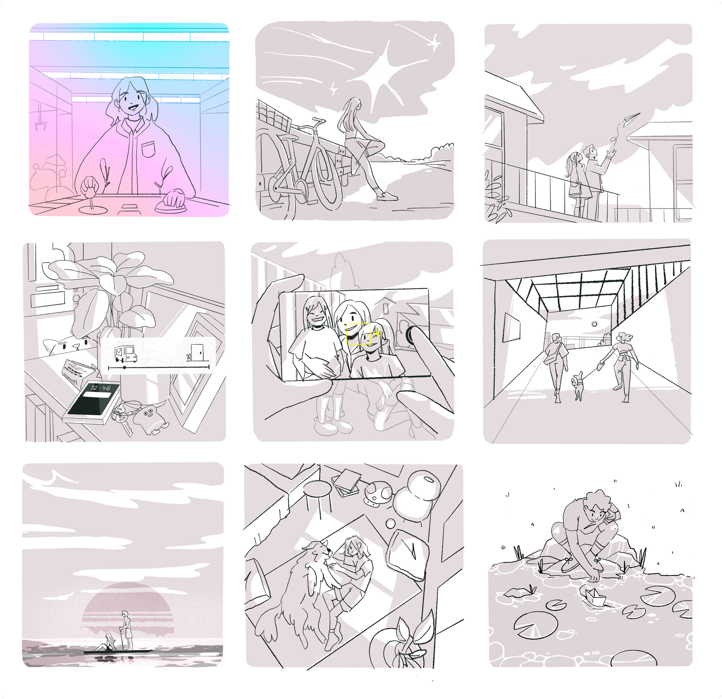
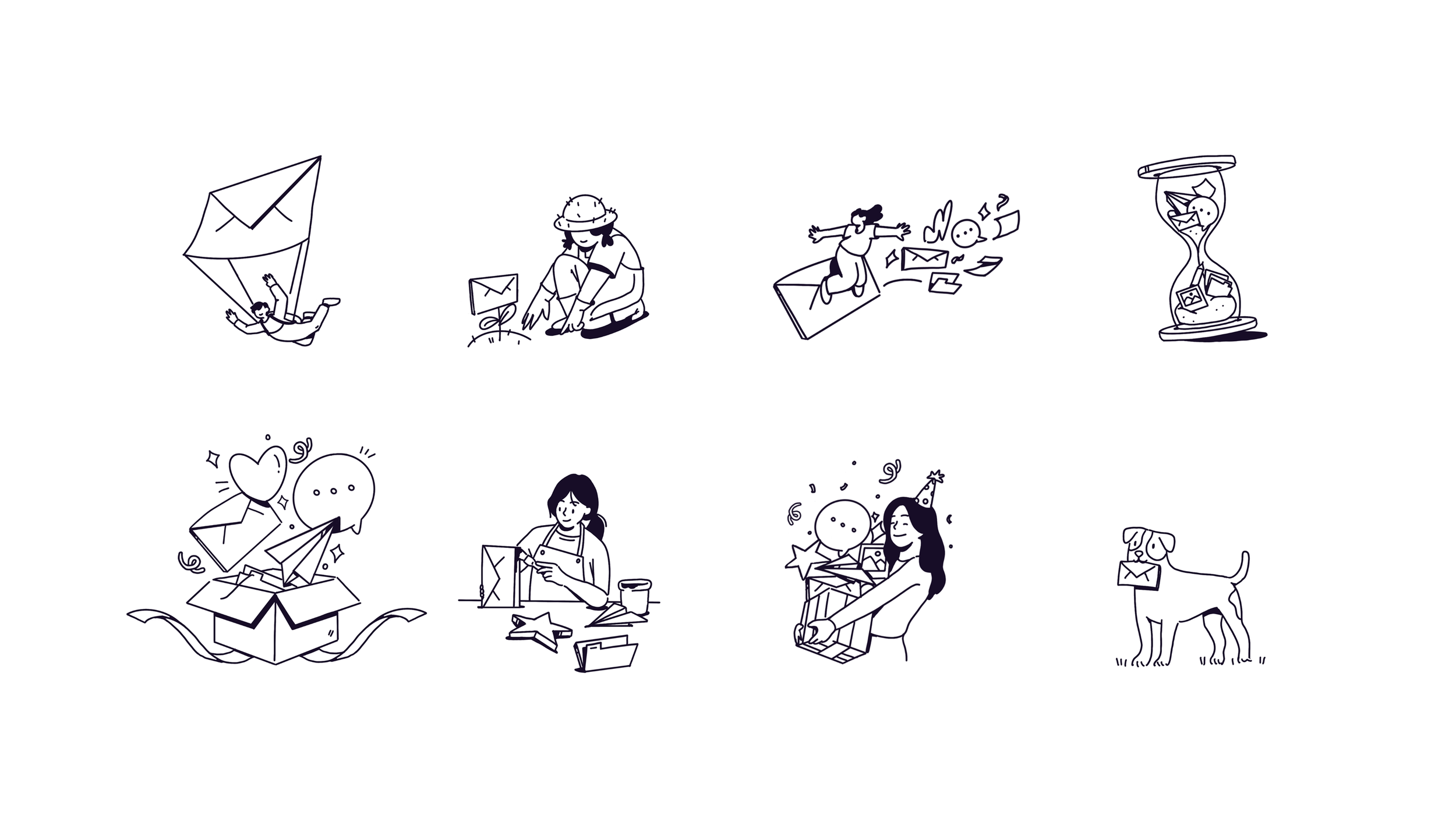
A few of my sketches for Yahoo’s Mail product. Grounded in storytelling, aiming for feeling nostalgic and have Mail sitting in the background of your day to day.
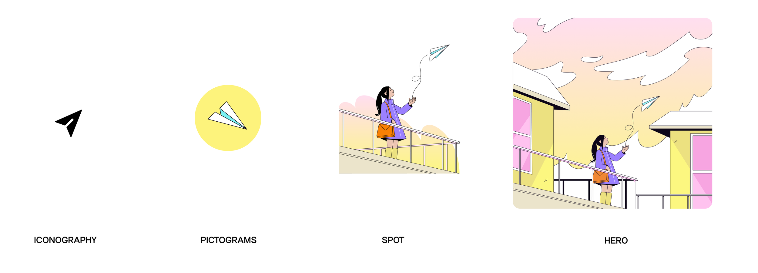
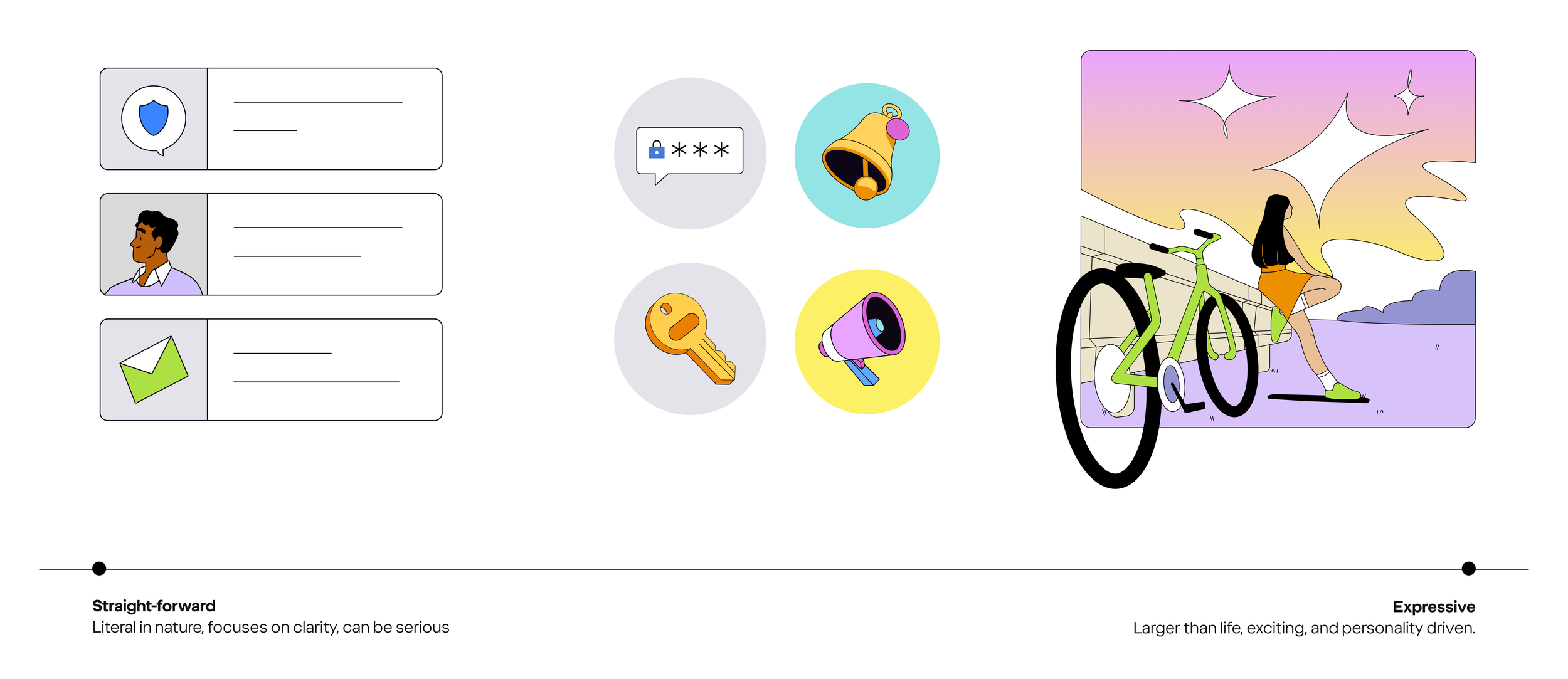
With my background in systems thinking, I advocated for a connected visual language that scales intentionally — from iconography to pictograms, spot illustrations, and all the way to hero moments. This layered approach ensures our product visuals feel cohesive, with a narrative thread that ties each level together and supports a unified story across Yahoo’s ecosystem.
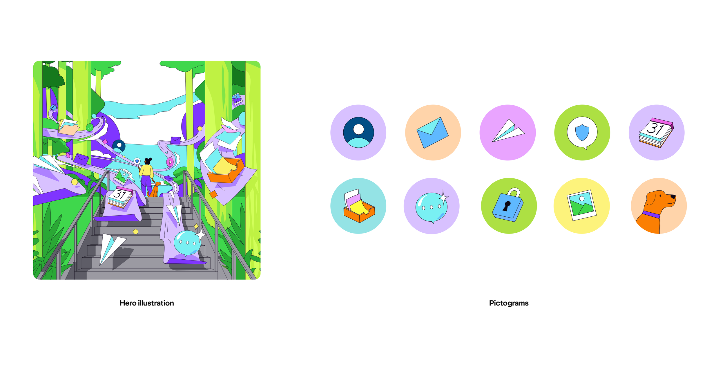
A key intention behind this system was the ability to deconstruct our larger-than-life hero illustrations into simple, expressive pictograms. This wasn’t just a visual choice — it was about world-building at every level. Each icon, no matter how small, carries a thread from the broader story, reinforcing a connected and consistent experience across the product.
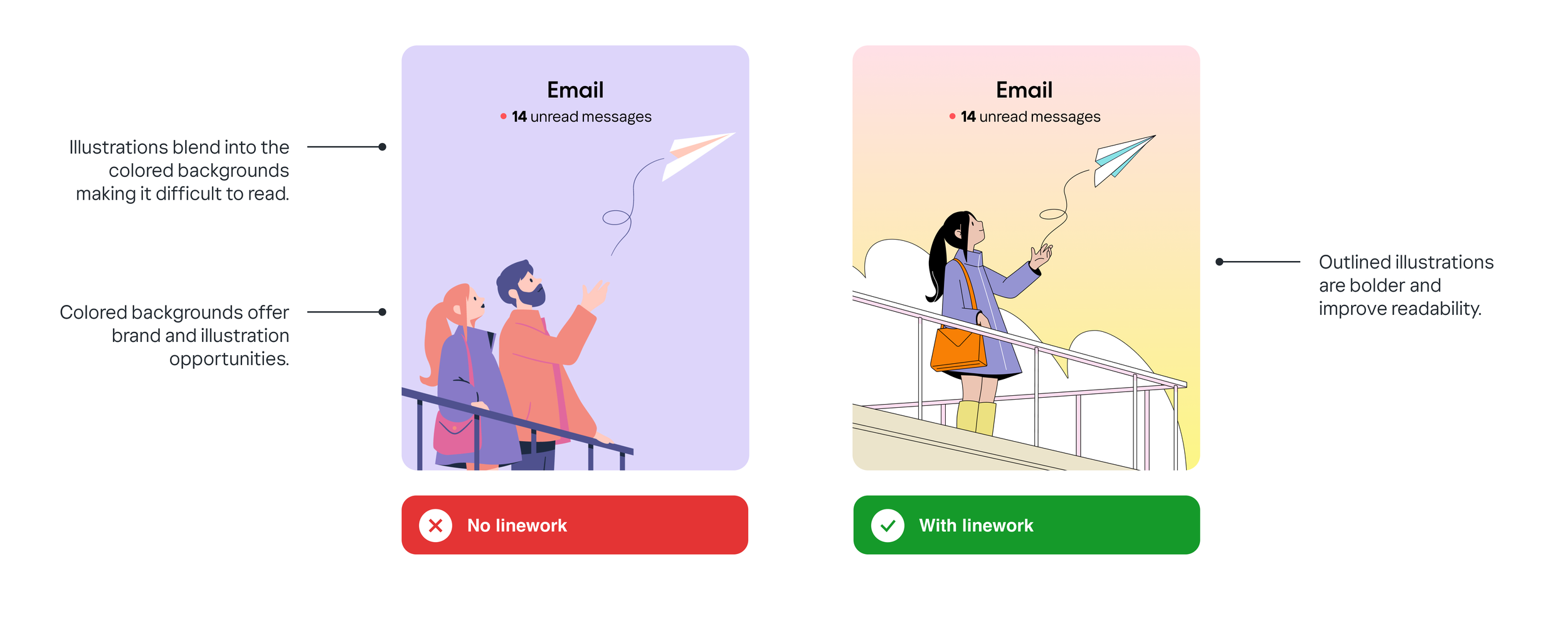
As part of our expanded product illustration guidelines, this section focused on accessibility and the effective use of color. We explored how illustrated elements interact with colored backgrounds — showing that outlined illustrations significantly improve clarity and legibility. By using linework, we maintain visual contrast while still leveraging color as a branding and storytelling tool.
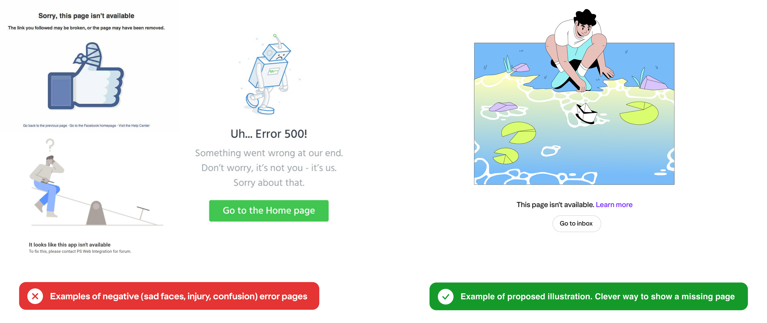
This moment in the guideline focused on empathy — making sure our illustrations always put users first. Instead of relying on visuals that show sadness, injury, or confusion, we explored more thoughtful, clever metaphors to communicate issues like a missing page. The proposed illustration avoids negative cues while still signaling that something’s off — a gentle, user-first approach to error states.
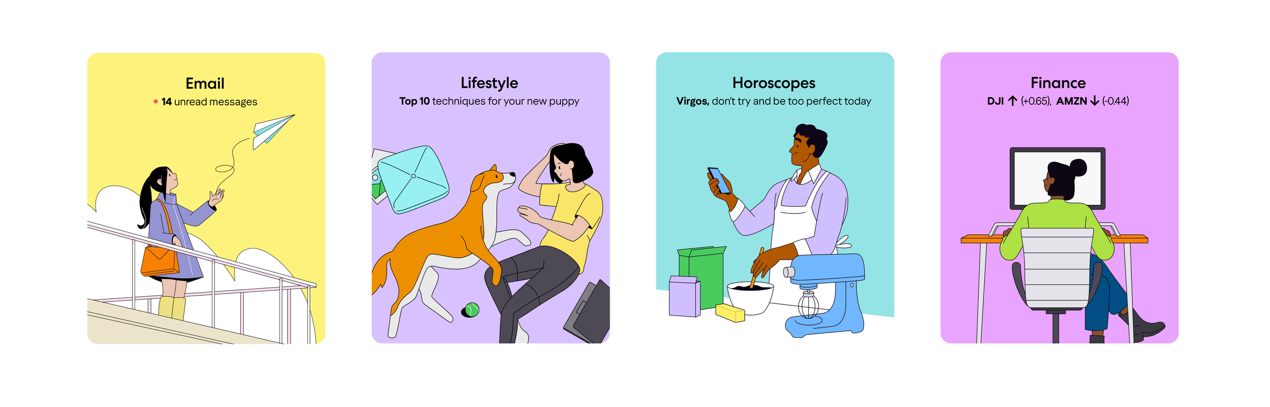
This is combination of Nick S and my work. I completed the first 2 cards, and Nick S covered the last 2 cards. We were able to ensure both of our ways of illustrated matched with the greater brand.
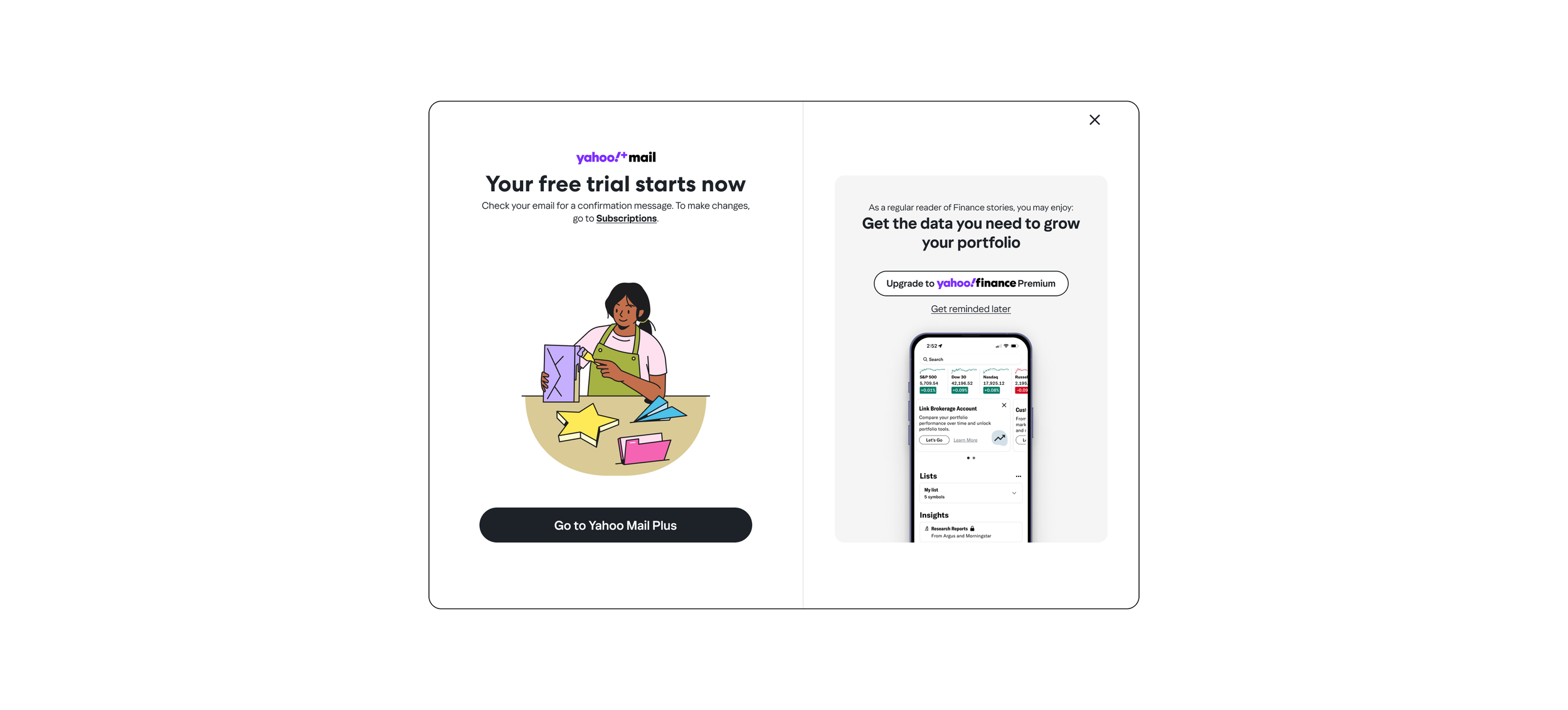
We began extending our illustration style into more product-driven projects, starting with Mail+ Subscriptions at Yahoo. This series was created to support the free trial experience, visually communicating benefits while evoking a sense of delight, ease, and celebration. Each illustration was designed to feel warm, personal, and in line with the broader Yahoo visual language — turning functional moments into thoughtful, engaging touchpoints.
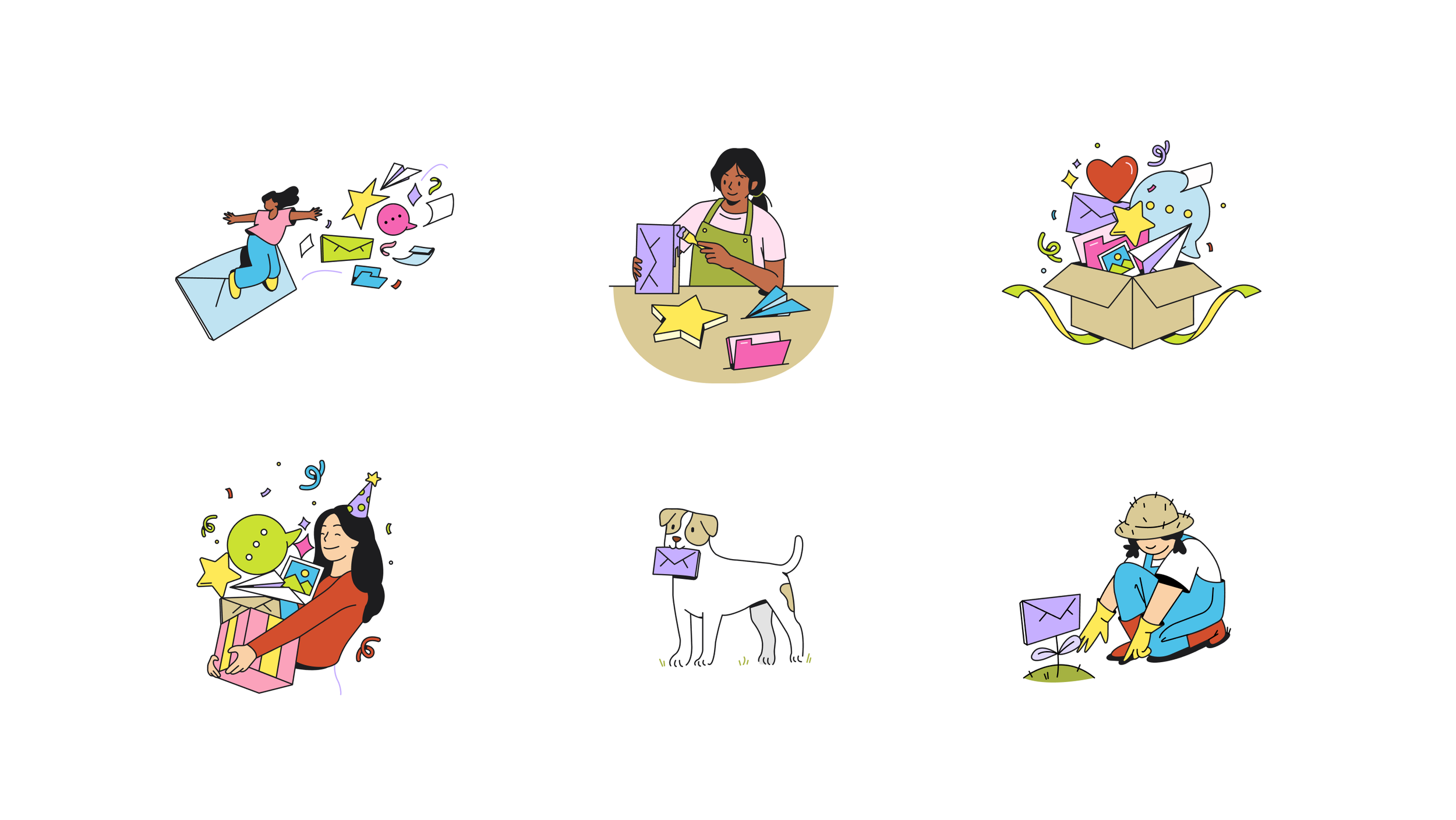
We introduced brand colors directly into the illustrations — using them to highlight key objects like envelopes, stars, and speech bubbles. We also experimented with inky shadows and tonal accents, adding warmth, depth, and a handcrafted feel.
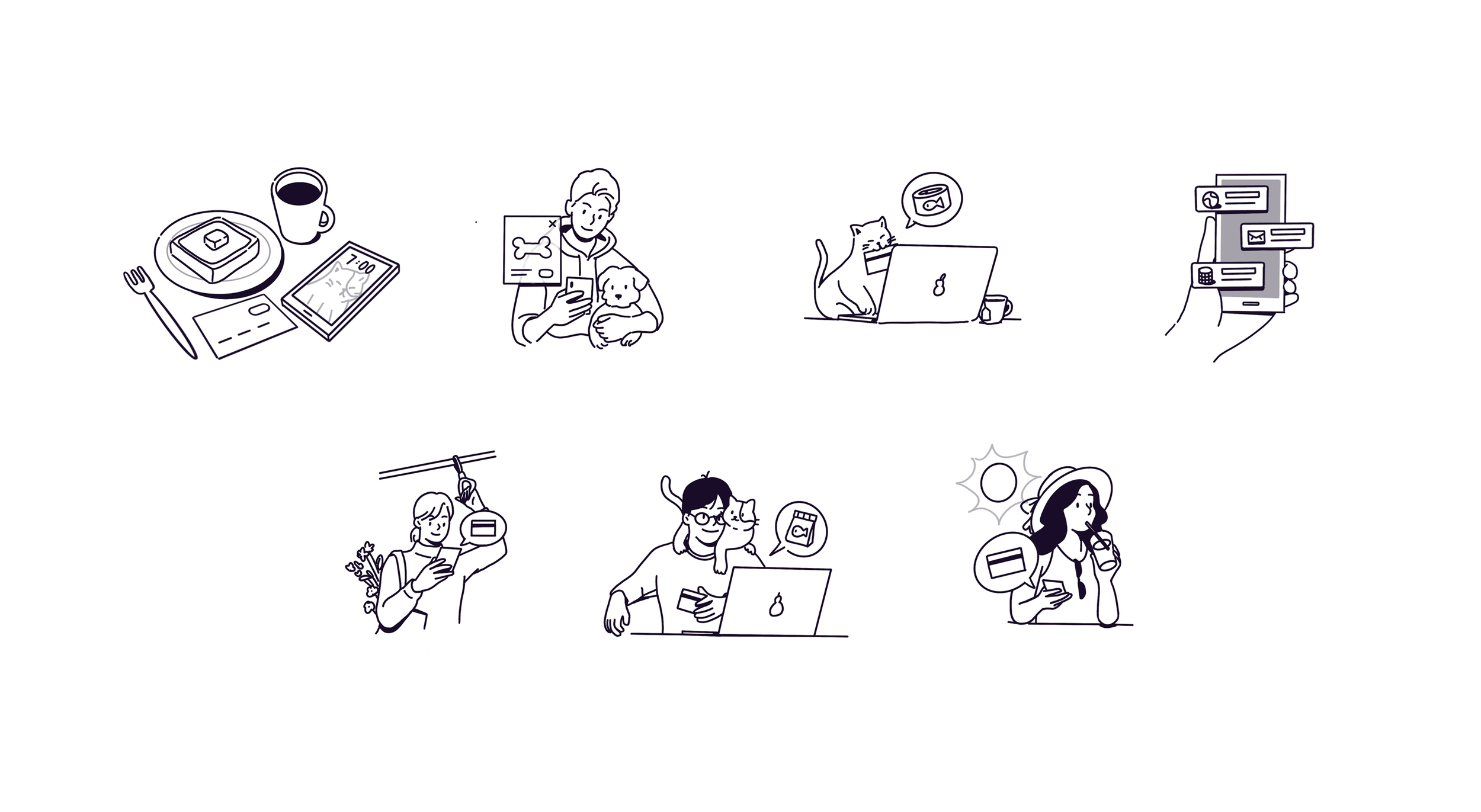
A series of Payment and Transaction sketches exploring how people interact with money in everyday moments — from morning routines and subscriptions to casual checkouts and pet expenses. These illustrations were designed to feel relatable, human, and warm, reflecting a range of lifestyles while capturing the quiet magic of seamless transactions in the background.
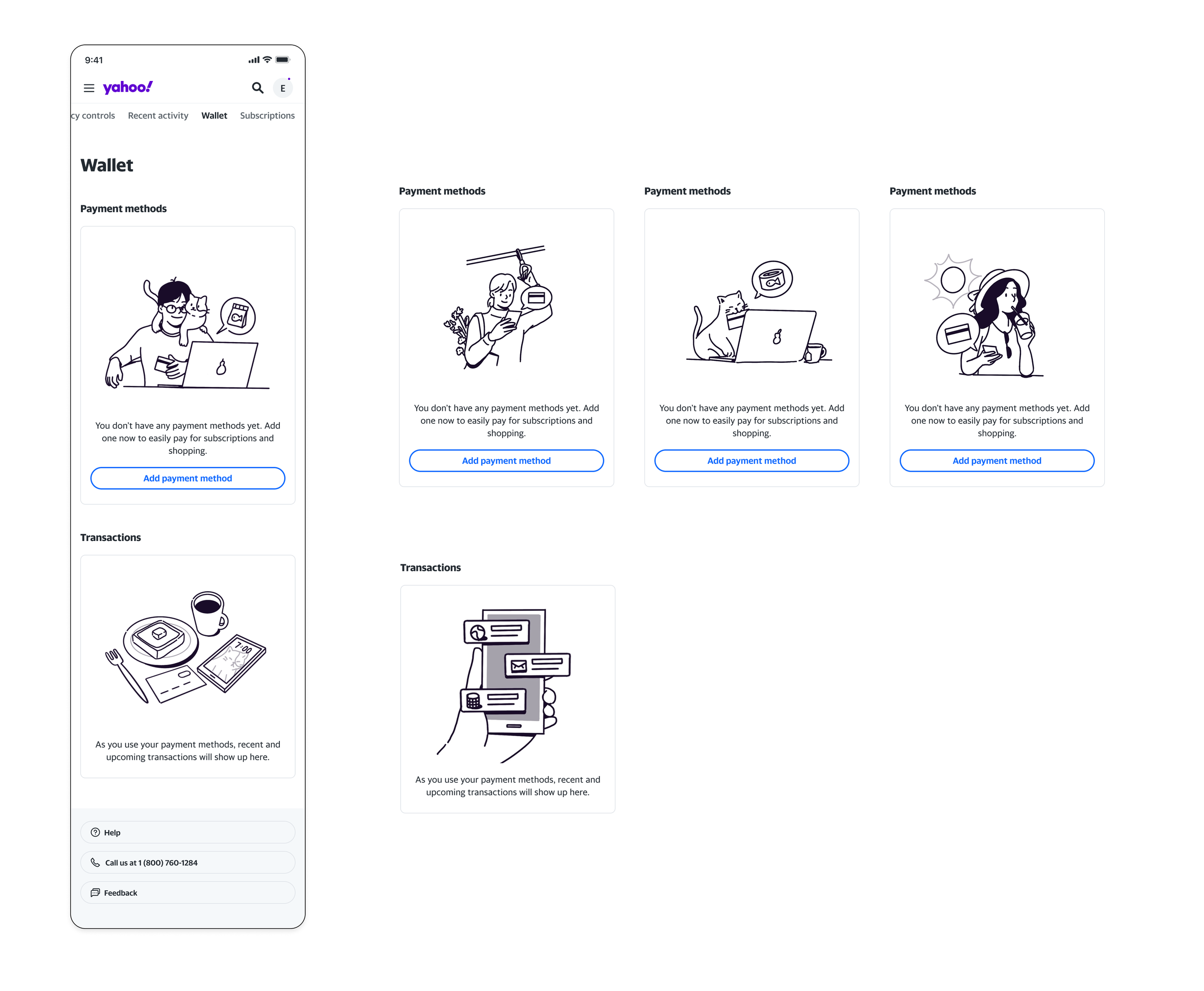
Always testing sketches in-context of product screens.