Navigation Iconography — Coinbase
Year
2022
Credits
Lead Illustrator: Maryanne N
Engineering Lead: Jennifer L
Partners: Cindy K (UXR), Riccardo C (Design, Navigation)
Problem and Opportunity
Coinbase was undergoing a major brand refresh to make its products feel more trustworthy, secure, and accessible in today’s evolving financial landscape. However, our existing icon system lagged behind — it only supported a single filled style, which felt outdated and visually heavy against the new brand direction.
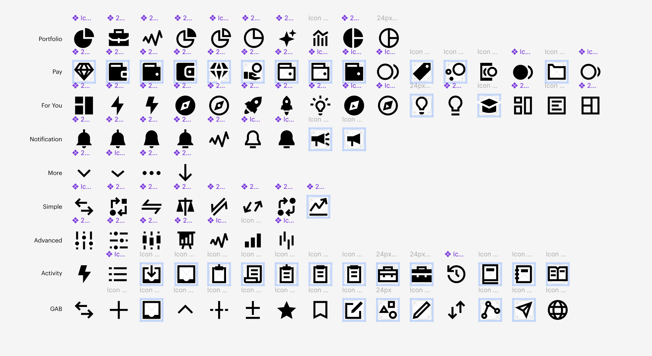
To address this, I partnered with our engineering lead to develop a new Navigation Icon Component that introduced dual styling: outline and filled, optimized specifically for navigation surfaces. This not only brought flexibility and visual balance to the UI, but also set a strong foundation for future enhancements.
We collaborated with UX research and product design leads to test and validate bespoke icons for key surfaces like Pay, Advanced, and DeFi, ensuring clarity and recognition. Alongside the component, I created robust usage guidelines to empower both designers and engineers to adopt and implement the new system with confidence — and to make it easier for future me (and others) to continue evolving the component over time.

Explored various designs, but the team felt strongest with the sharp, literal, universal symbolism look and feel.
Eeek, some of the explorations I worked on. Don’t judge me.
When I joined this was the current design I was working with. The icons still felt a bit chunky here, but based on the design refresh the icons would fit better with the new typeface.

Riccardo L worked on the new Navigation bar (sick!). The typeface also got a facelift (heck yeah!). Updated few of the icons (look very nice!).

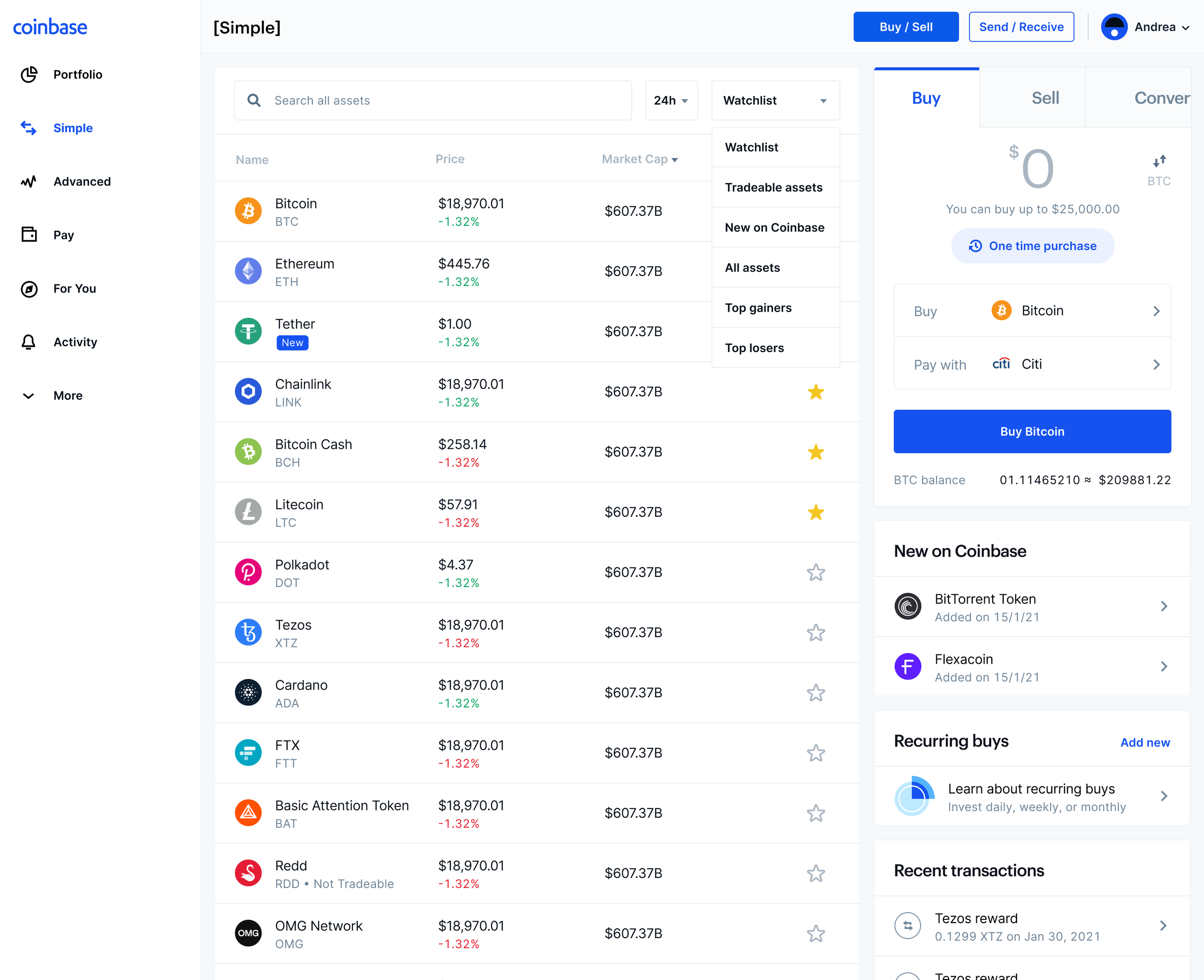
Commerce was a fast follow with testing how the Navigation Component works with other products.
Research
Research came in clutch in helping us define our iconography guidelines and shape a more consistent, thoughtful visual language. I partnered with Cindy K to explore critical questions around icon recognition, user preferences, visual clarity, and the impact of labels.
Testing icons at this level of depth is rare—but it’s something I believe more companies should invest in. Icons are functional, not just decorative, and they carry real weight in how users navigate, interpret, and trust your product. This study helped us better understand familiarity, cognitive load, and how icons can show up as clear, supportive tools rather than ambiguous visuals. Below is a preview of the research (not all slides shown).


