Yahoo’s first ever icon component — Yahoo
Year
2023
Credits
Lead Illustrator: Maryanne N
Partners: Eric B (Engineer, Design Systems), Luke Carter (Production Design)
Problem and Opportunity
Yahoo needs to have an iconography component. There are over +200 up arrow icons on News, Mail, Sports, and Finance. There could be just 1! I was able to draw Yahoo's first icon system linked to their newly upcoming design system.
The goal was an approachable, contemporary, versatile, and ownable system. I wanted the icons to be designed to feel at home on any Yahoo surface, while some icons have that extra *wink* for those unexpected moments. I worked with Eric B to build a component that engineers from any team could pick up and be able to use our props: introducing three sizes, outline and fill, choosing from our recommended system colours and more.

Yahoo did have an icon library. However, it was only a sticker sheet, one size, not all in the same style, no education guideline to empower designers and engineers, no distribution guide for delivering icons to engineers, difficult to manage icons, easy to miss an existing icon and create a duplicate.

Yahoo has a TON of products. So many things are happening at Yahoo: brand refresh, new brand positioning, every product getting it's own refresh, new type, new illustration style etc. Things aren’t set in stone. Why start an icon refresh NOW?


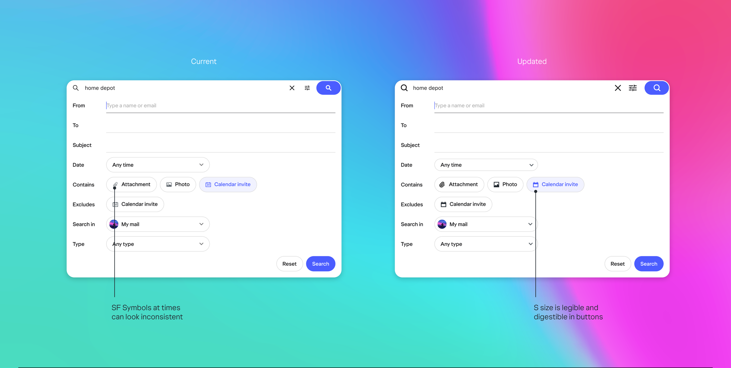
Existing icons look great on their own, however, when grouped with other icons there is a lack of visual cohesion and consistency. Icons should always feel like a family when they’re next to each other.

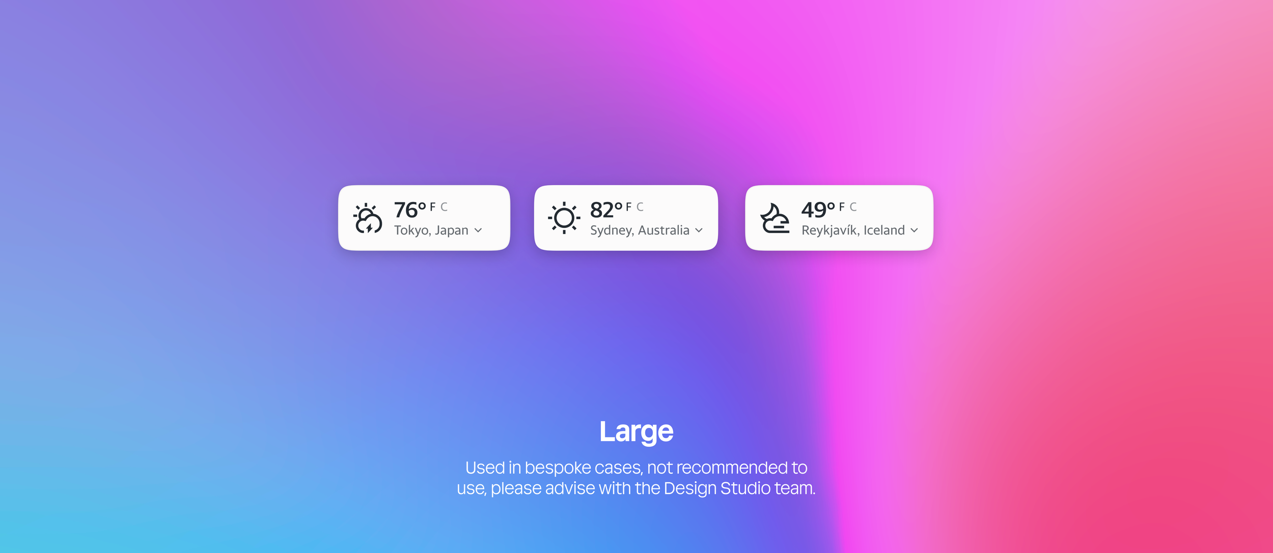
Our icons are intentionally sized, designed, and curated at 3 sizes. Details are added or stripped back depending on the size. We want to give designers and engineers more options to create beautiful designs.

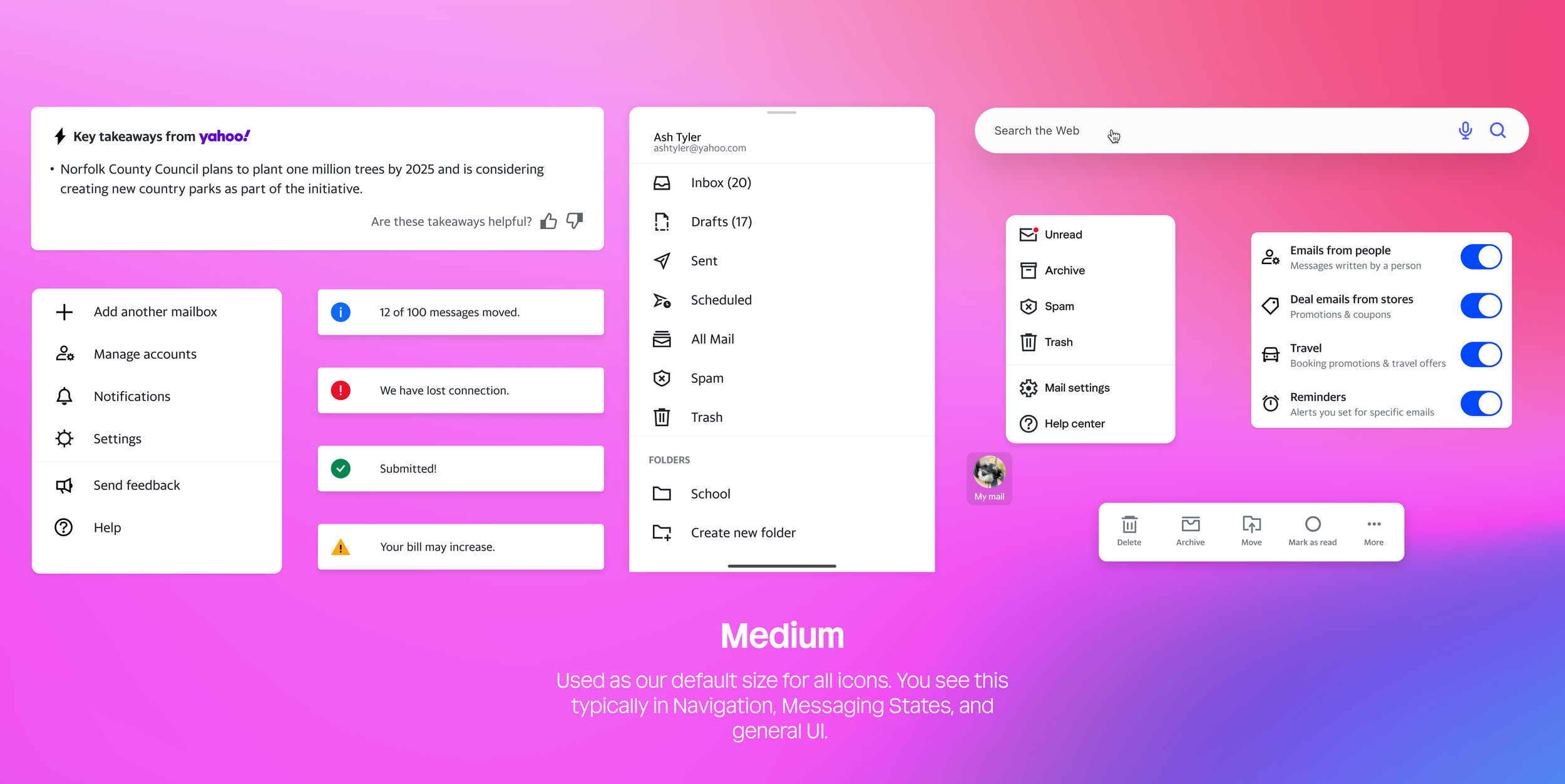


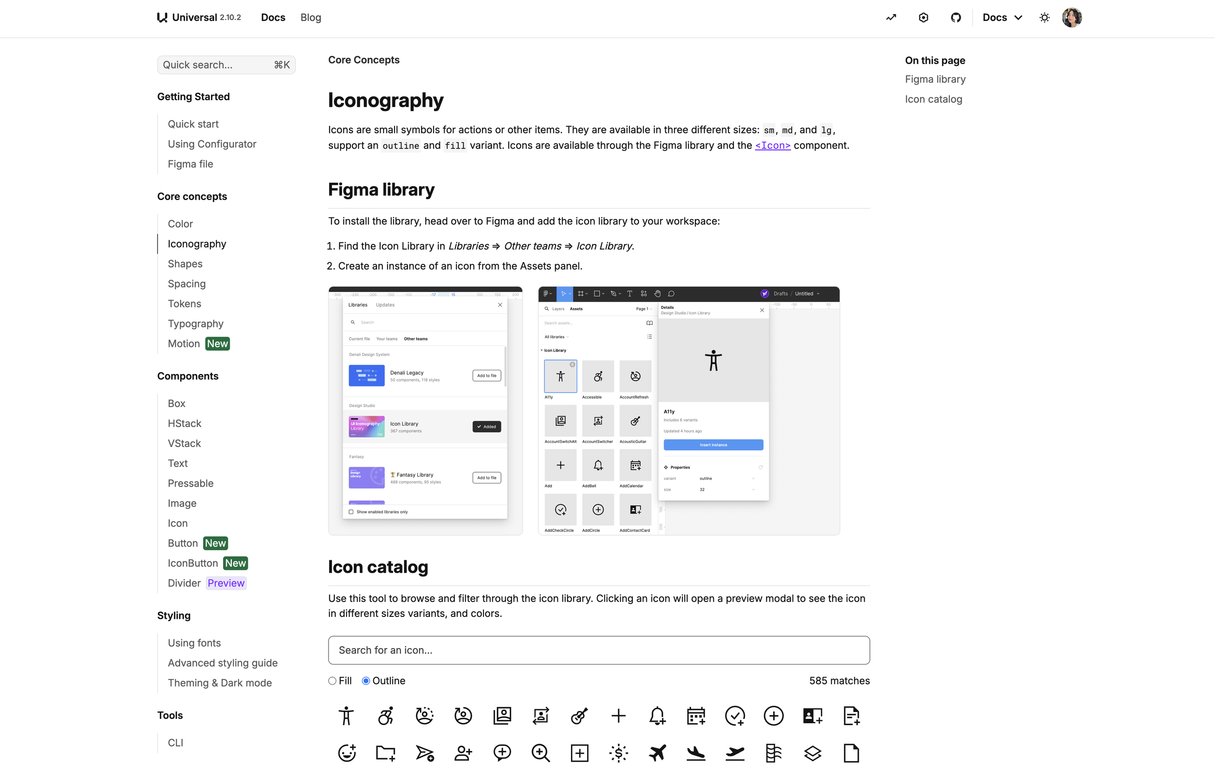
Worked with the design system team to build out the icon component with guidelines and usage.
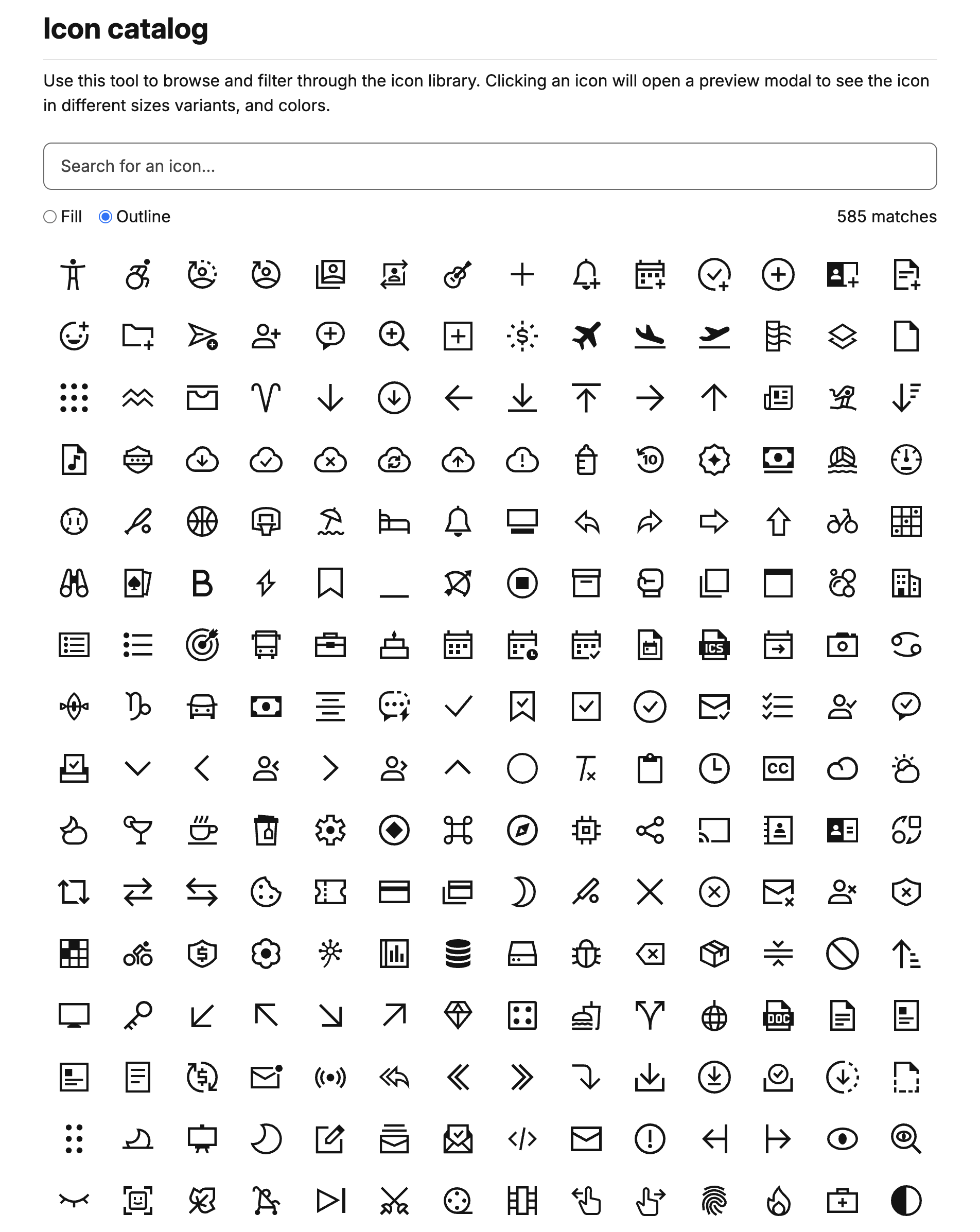
Searchable, switch from dark to light and fill to outline, and accommodate 3 difference sizes.