react-beautiful-dnd branding
“Drag and drop is an intuitive way of moving and rearranging things. We at Atlassian have recently released react-beautiful-dnd which makes drag and drop for lists on the web more beautiful, natural and accessible.” — Author of react-beautiful-dnd, Alex Reardon. You can read more about Alex’s latest work in his blog post.
With the new release of react-beautiful-dnd comes with a new logo. Below is the previous logo which was inspired by the craft of origami by Jeniffer Heng (designer @ Atlassian). Crisp, sharp and clean was part of her inspiration.

Starting Point
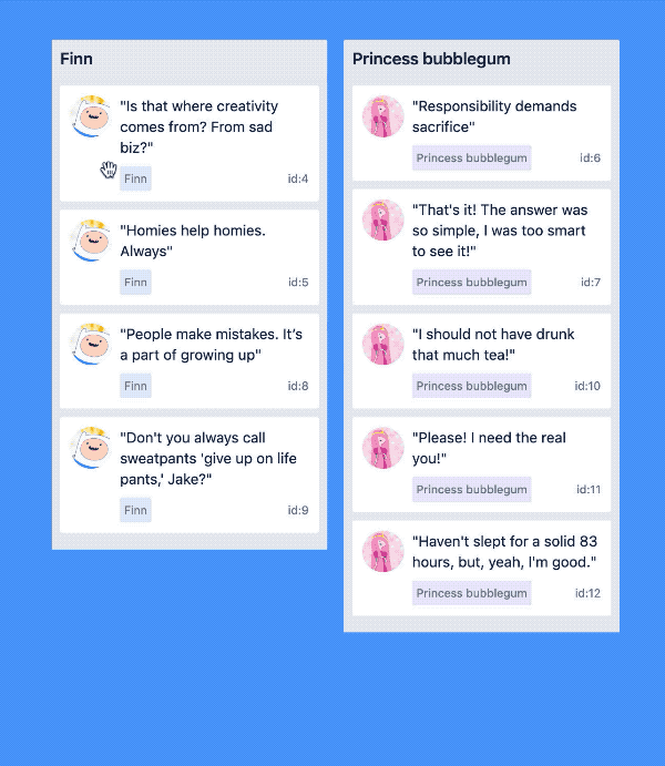
I remember when Alex first gave me the brief, I just sat in front of my screen for a long time watching the prototyping videos he sent me. Over and over again. Hypnotized by moving cards and the wonderful quotes from Adventure Time. Based off what I was seeing, I begin to write down words that resonate with me.

To most people my notes don’t make sense, but to me these were the words that I wanted to be carried throughout my journey of making this logo. In some way, they’re like principles. If you can’t read my hand writing these principles were: drag, playful, jumpy, organic and outline.
Sketching and Ideation
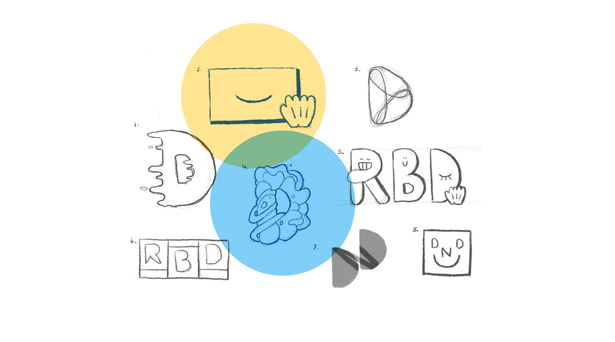
Keeping in mind with the words I’ve written down I start sketching concepts on my iPad. Some conveying movement, others focusing on character. I wanted to have an array of concepts that really captured the playful nature of what react-beautiful-dnd is. The choices that Alex and I liked the most were #2 and #4. Interestingly, one logo being literal and the other being metaphorical. Oooh.
Hi-fi Logos: Color and Shape
Literal approach
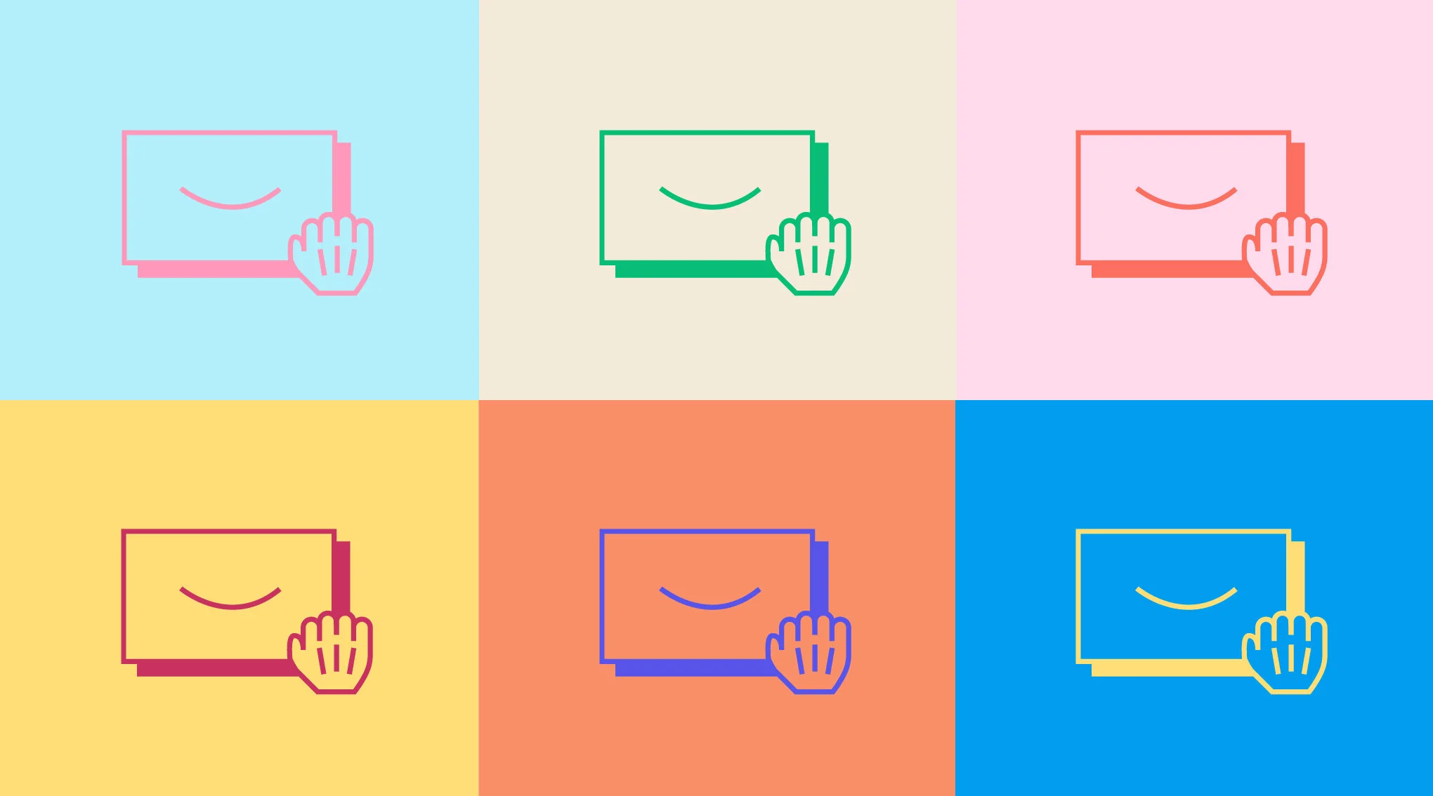
The more I looked at this component, the more I realized “why not illustrate a logo that is literal?!”. react-beautiful-dnd would be used by many and whatever it turns out to be, this would be the original piece. I wanted to capture the card and the drag cursor with the final touch in adding the face which injected the playfulness it needed making is something truly special.
Designing icons at Atlassian has helped me develop that understanding and thought process. Sometimes you don’t need a grand story to depict an icon, sometimes it can be what it literally is.
The ‘just smile’ version looked like a closed eye, lowkey giving me illuminati vibes and we ended up scrapping it.
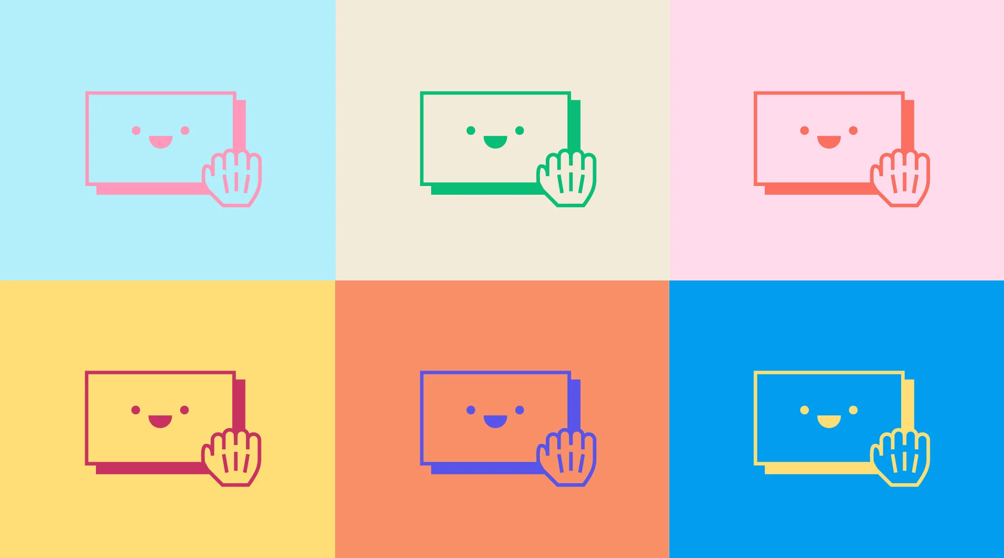
My feelings in terms of color would be that this logo can sit on any background and be any color. I wanted the logo to be inclusive, accessible, and not be directed by one color.

Metaphorical approach
The reasoning behind this idea was this sense of movement like it was floating in space. Shapes within form in the shape of a ‘D’ symbolizing that this pattern is formed by many and not by one source. You’re probably thinking, why the ‘D’? Honestly I wanted to experiment with the lettering. This does come with some caveats: having the word mark included would feel unnecessarily repetitive and the logo feels lost when injected with color (as you can see below).
Final Logo with Wordmark
We chose Space Mono as the type paired with the logo because it captures the general shapes of the illustrative logo.

There is something wonderful about this logo. It could be the simplicity, the playfulness or just internal spark you get from the smile the logo gives you.