Solitaire Game, Yahoo
Credits
Illustrator: Maryanne N
Visual Designers: Maya E, Jeff H
Motion: Greg E
Products: Yahoo Games, Yahoo News
Year
2025
Problem and Opportunity
Yahoo Solitaire had fallen behind the times. The game's visual style felt dated and disconnected from Yahoo's broader brand identity and illustration standards. The interface lacked the polish and cohesion that modern users expect, creating a disjointed experience that didn't reflect Yahoo's evolution as a brand.
With plans to launch a roadtrip-themed update, there was a clear opportunity to modernize the entire experience. This wasn't just about adding new content, it was a chance to realign the game with Yahoo's visual language, refresh the UI to feel contemporary, and create a more engaging, cohesive experience that would resonate with both existing players and attract new ones.
However, this required a significant illustration effort. I partnered closely with the Design Studio's visual design team to develop a entirely new art style from the ground up: one that would honor Yahoo's illustration guidelines while bringing the roadtrip theme to life in a way that felt fresh, playful, and distinctly Yahoo.
The roadtrip theme provided the perfect vehicle (pun intended) to reimagine Solitaire's look and feel while maintaining the classic gameplay users love. The end goal was to provide concept art, game system language and resources to the Yahoo Games team to create the overall game.
Process
The project began with exploring two stylistically different visual directions: Yahoo's updated product illustration style and a more organic, brush-based approach for the landscape elements.
Since I was already familiar with Yahoo's product illustration style, I was able to quickly execute explorations in that direction. However, I was also asked to bring my personal brush style into the mix: specifically for creating landscapes. This dual approach allowed us to evaluate how a looser, more expressive aesthetic might complement the cleaner product illustrations, and ultimately find the right balance between consistency with Yahoo's brand and the warmth needed for an immersive roadtrip experience.
When the exec team and stakeholders reviewed both directions, the choice was clear: product illustration. This approach not only aligned seamlessly with Yahoo's broader brand work, but also offered practical advantages in terms of reusability and scalability—critical factors for a game that would need ongoing content updates and potential expansion.

This work was great, however was completed by a contractor outside of Yahoo. The mark missed in some areas because it missed the Yahoo charm and aligning with the new brand guidelines. These screens cover the region, US map and the journey within the region.

Additionally there was the game screen that had some interactive components and illustrative aspects.

The mood board the visual design team wanted to see, they included some of my past work with landscapes. There was a gestural and textured charm to them which allowed the landscapes to shine.

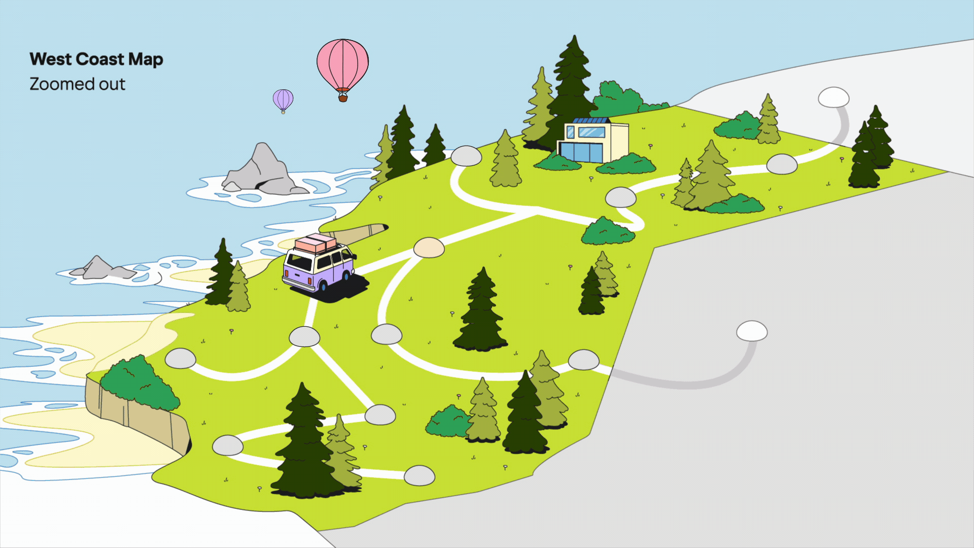
We decided to lock in on the West Coast since it was familiar with our stakeholders. These sketches explored a range of one point perspectives at low and higher angles. It truly felt reminiscent of my time living in San Francisco and going on road trips during long weekends to Lake Tahoe or Big Bear. I wanted these to feel like a postcard / photo moment that you take on long trips. Additionally the RV was inspired by my long conversations with my doorman of the dream to travel around America and have your tiny home be with you (shout out to my doorman, Felix!!).


When drawing these I mirrored Yahoo’s brand color system and shape language. It was interesting to draw these since our style didn’t have many building or bridges in our library.

These were drawn by a contractor to in a badge style for the landmarks. These were representational for the organic brush style.

Additionally, the promise of this work was the ability to reuse components in the illustrations to build out the rest of the system needed for the game. Here is an example of being able to pull out the vehicle, trees, bushes and air balloons.

Process and story continued…
With the product illustration direction confirmed, we had free reign to really expand and push Yahoo's illustration style into new territory. This project gave us the opportunity to explore landscapes, nature, and map work through a gameified lens—something Yahoo's illustration system hadn't tackled at this scale before.
I drew heavy inspiration from Overcooked, particularly how they approached their map design and the way gameplay flowed through visual storytelling. That sense of whimsy and spatial clarity became a north star for how I designed the roadtrip journey: creating landscapes that felt inviting and playful while maintaining the clean, vector-based aesthetic of Yahoo's product illustration style.


In order to add motion and still maintain the angle of the RV, I played around with the perspective of the map and how to envision the long term / end goal to how the user would move around the map.


Greg made this awesome quick animation to show the motion of the RV and how the pins place on the map. There were some issues that the pin didn’t have enough contrast, however with motion it really does help with the visual story.

This is a close up of the map and using the landmarks as polaroids to give that tangible look and feel.

Each region had it’s own color system and I wanted the back of card design to mirror the brand mark that I illustrated with the RV going into each region with a bespoke visual to what it represents.

These were updated by Nick S using our illustration style and color system.


Side Quest
Another side quest within the Solitaire project was reimagining the power-up icons for the game. The original icons felt generic and overly UI-focused—they had that cookie-cutter quality that didn't match the energy or playfulness we were bringing to the rest of the experience.
I created an original set of power-up icons that felt more compelling and interesting for a game environment. These weren't just functional markers—they had personality and visual appeal that made them feel like actual game elements rather than sterile interface buttons. The new icons brought the same illustrative style and polish we'd established for the roadtrip theme, creating a more cohesive and engaging player experience.


Final thoughts
Throughout the process, it was a joy to work with such a powerful and talented team. This project was a refreshing change of pace from the more functional, UX-driven product illustration work I typically do. Getting to create art that was less about utility and more about world-building and atmosphere felt creatively liberating.
I've always dreamt about illustrating for games—it was an early aspiration of mine. Getting a taste of concept art creation, developing a cohesive visual system, and producing game-ready assets was incredible. It reminded me why I fell in love with illustration in the first place, and proved that product design and playful storytelling don't have to be at odds—they can elevate each other.