Weather Icons and Illustrations, Yahoo
Credits
Illustrator: Maryanne N
Designers: Cait B, Doug L
Year
2024
Problem and Opportunity
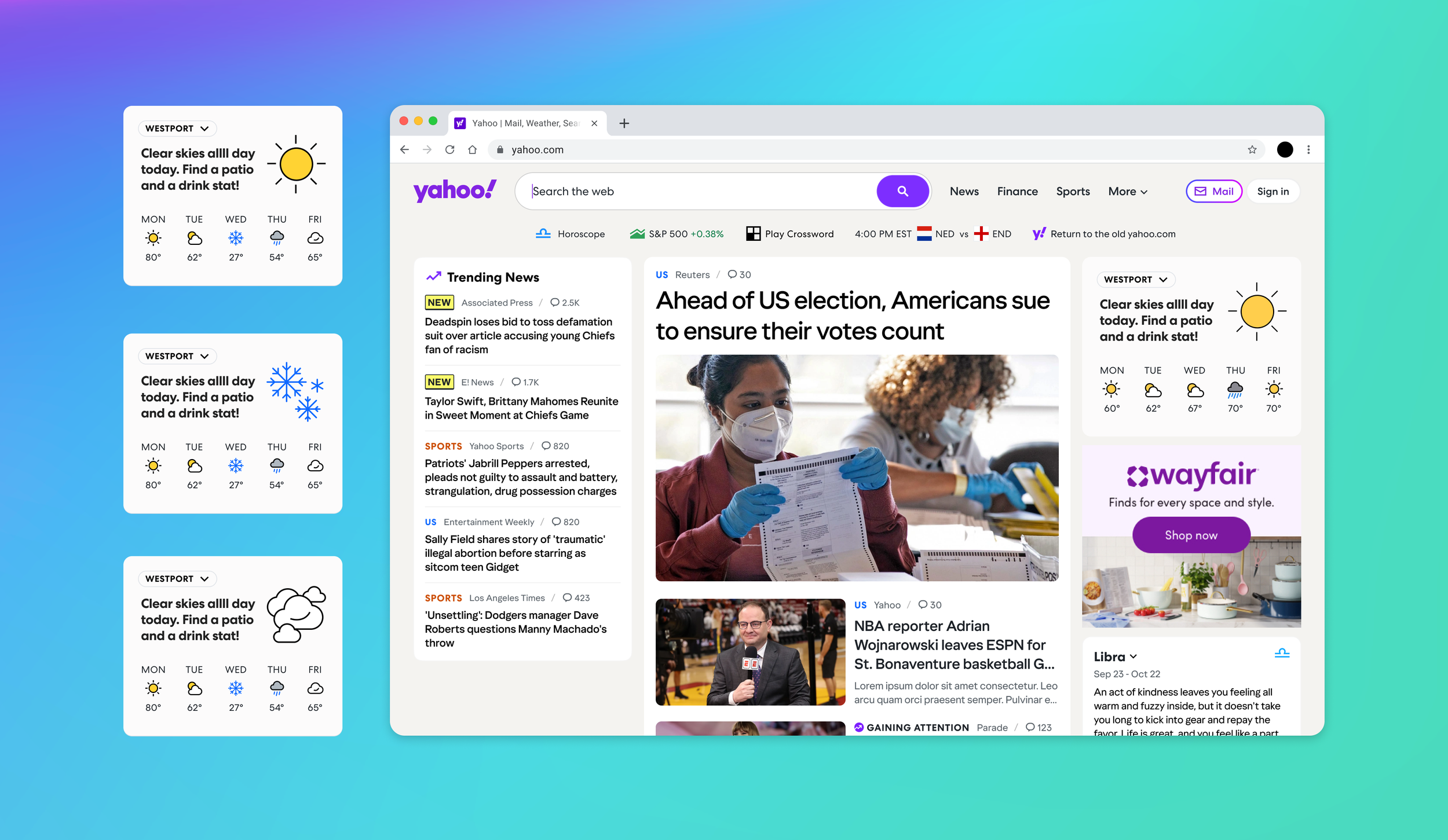
I initially worked on refining Yahoo’s single-color icon set, ensuring consistency and clarity across our system. With the growing needs of products like Weather, I helped level up the system to support multi-color icons — enhancing the component, creating usage guidance, and enabling programmatic switching. This upgrade not only improved visual recognition and cognitive ease for users, especially in weather contexts, but also unlocked opportunities for other teams at Yahoo to adopt multi-color icons where needed.

All the weather icons come in 3 sizes: 32px, 24px, and 16px. This was a must as the weather icons come in multiple variations and moments.

These are all the icons in 32px: day, night, thunder, rain, and more!

Light and dark mode versions. The subtle switch from day to night in the weather illustration is the charm and delight we have in our illustration system.

The widget illustrations were designed with tone flexibility, supporting both neutral and expressive styles. Neutral illustrations focus on clarity — they’re literal, informative, and suited for daily utility. Expressive illustrations, on the other hand, were reserved for select moments where we could introduce a bit of delight without distracting from the core experience.
These expressive visuals were never used for catastrophes or severe conditions — instead, they were playful, personality-driven moments meant to surprise and charm the user. The concept centered around the idea of the weather widget as a window to the outside world — a quick, visual peek into what’s happening, whether it’s “giving cloudy” or just patio-perfect.

Weather product with some of the icons and illustrations.
Neutral weather illustrations

Expressive weather illustrations